INTRO
Led the architecture, governance, and adoption of a token-driven design system across 7+ products and multiple business units, establishing the component model, contribution process, and design-to-code pipeline that eliminated fragmentation and accelerated delivery organization-wide.
Role: Design System Lead
Scope: 7+ Products / Multi-BU
Team: 7 Designers + Dev COE
Stack: Figma • React • Storybook
Tokens: Style Dictionary
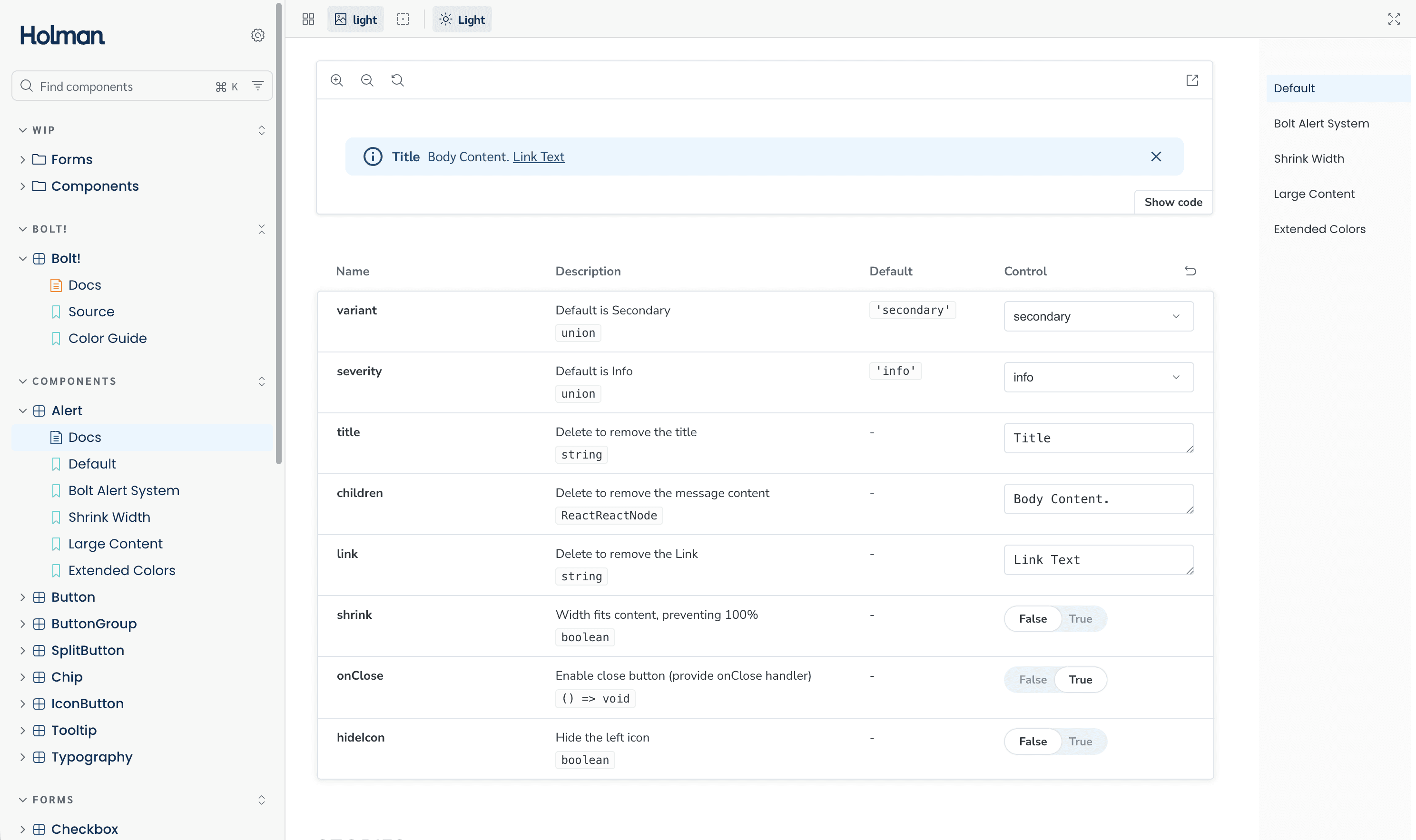
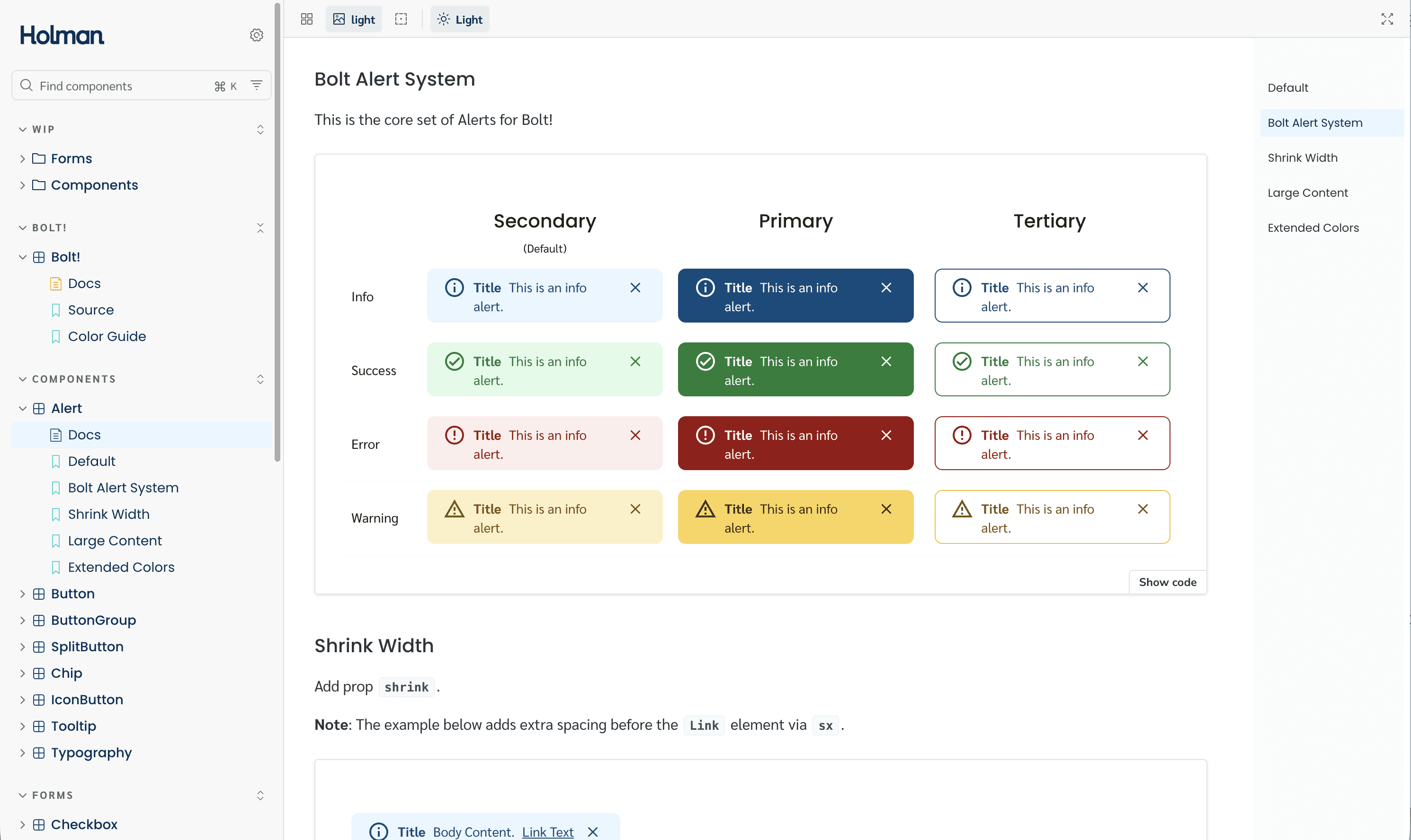
150+ Compontents Built & Documented
~35% Faster Design & Dev Cycles
Significant reduction in UI inconsistency & rework
BUSINESS
design system, figma, storybook, react
YEAR
2025-26

THE PROBLEM
Seven Products. No Shared Language.
Holman's product portfolio had scaled across fleet management, driver services, and operational tooling, but design and engineering had never kept pace. Each product team had built its own UI patterns, component conventions, and interaction models in isolation.
The symptoms were everywhere: the same data table rebuilt four different ways. Cards that looked and behaved completely differently depending on which product you were in. Buttons with inconsistent sizing, states, and naming across surfaces. Engineers re-implementing what designers had already solved. Designers re-solving what engineers had already built.
There was no token strategy, no governance, no contribution process, and no single source of truth.
The Resulting State
UI inconsistency across every product surface
Duplicated component work in every sprint
Slow, error-prone design-to-dev handoffs
No accessibility baseline across products
Growing technical debt and maintenance burden
Designer silos — no shared vocabulary or naming conventions
Engineering naming and design naming had no alignment
"We had six different versions of the data table; each built for one product, none usable by another. Every team was solving the same problem from scratch, every sprint."
CONSTRAINTS
How the System Was Structured
Before a single component was built, I established the architectural foundations — how the Figma library was organized, how tokens were named and structured, and how those decisions mapped directly to code. Getting this right upfront meant the system could scale without structural refactoring later.
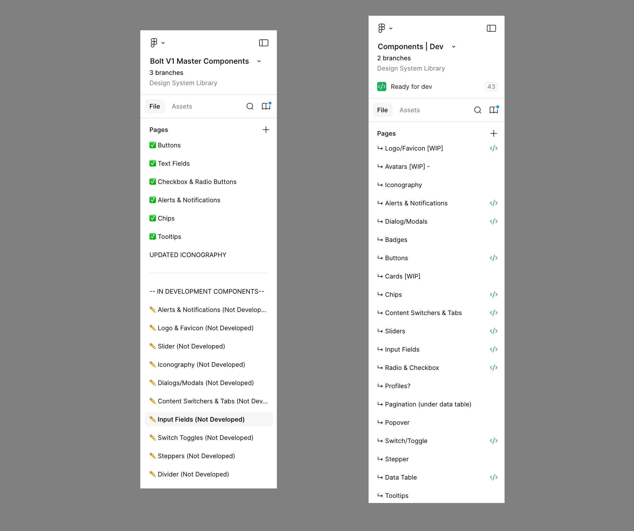
Figma Library Organization
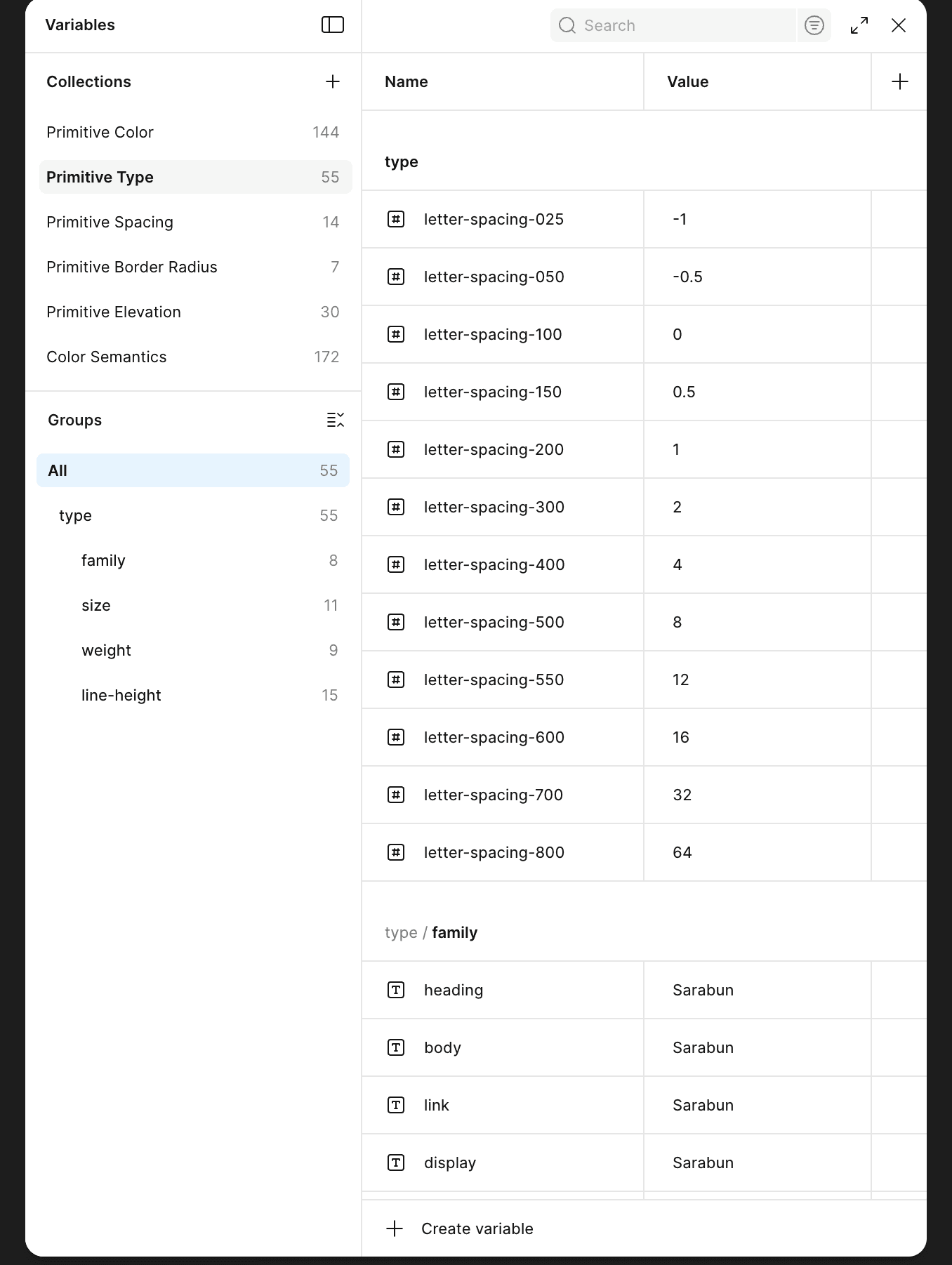
The library used an Atomic Design structure — Atoms, Molecules, Organisms — layered with category-based navigation for discoverability. Designers could navigate by abstraction level or by component type.
Atoms— Tokens, Typography, Color, Icons, Spacing
Molecules— Buttons, Inputs, Badges, Tags, Avatars
Organisms— Data Tables, Cards, Modals, Navigation, Forms
Patterns— Page templates, workflow layouts, empty states
Each component included an embedded usage brief directly in the Figma file — a lightweight spec documenting what the component was for, when to use it, and when not to. This was the starting point for Storybook and Wiki documentation.
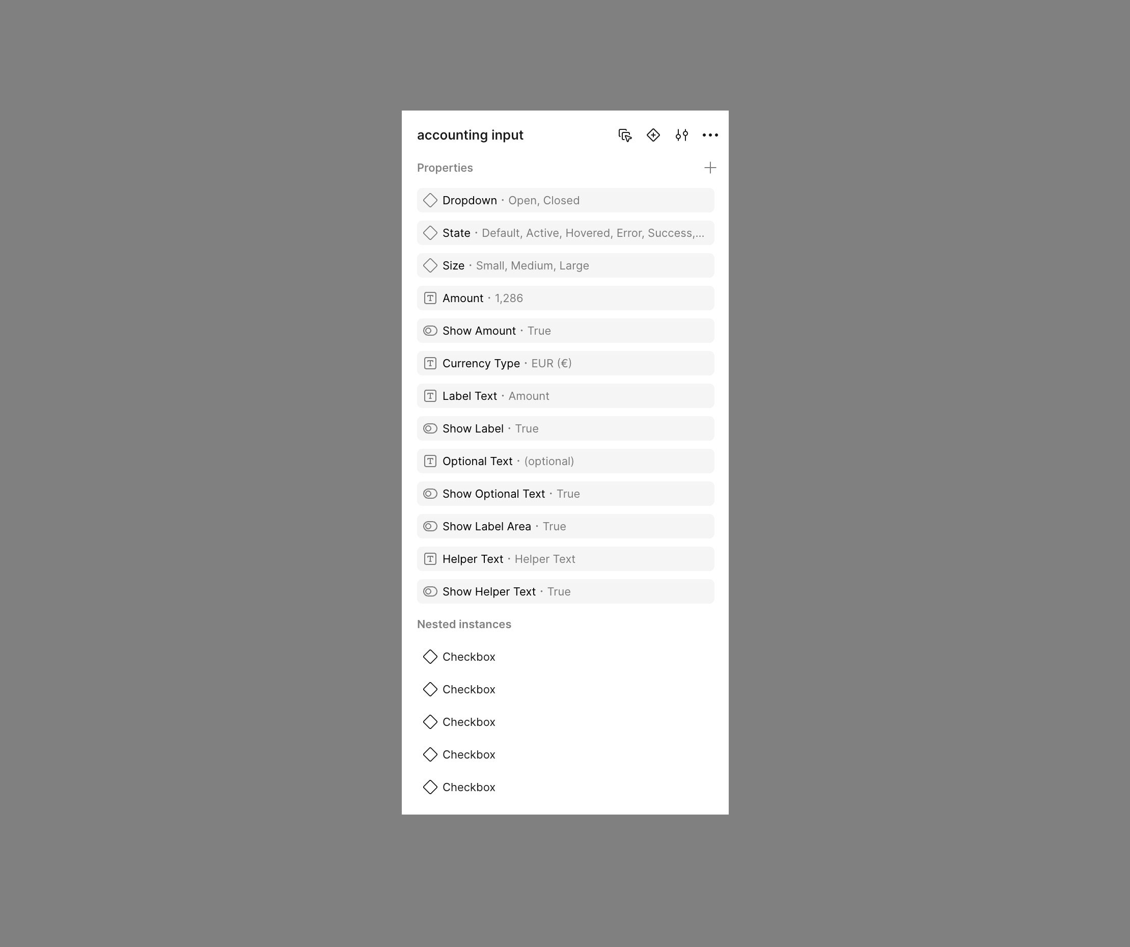
Variant Logic & Property Architecture
Component variants were structured to mirror React props directly — so what a designer could configure in Figma was exactly what a developer could pass as a prop. This eliminated interpretive ambiguity in handoff entirely.
Variants were limited to meaningful configuration axes to prevent sprawl. Each component had a defined, bounded property set:
Size— sm / md / lg
State— default / hover / active / disabled / error
Variant— primary / secondary / ghost / destructive
Density— compact / default / comfortable (for data-heavy UIs)
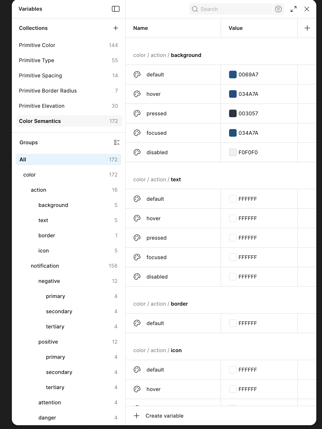
Token Naming Convention
Naming conventions were designed to be legible to both designers and developers — structured so the path itself communicated category, role, property, and state without requiring lookup. The goal was zero ambiguity between what a token was called in Figma and what it was called in code.
/* Token structure: category / role / property / state */ color/ action/ background/default → primary button fill background/hover → primary button hover state foreground/default → text on primary button feedback/ error/background → error state fill success/foreground → success text / icon color brand/ primary/default → Holman brand primary buttons/ size/ large/padding-x → mapped to spacing/5 large/padding-y → mapped to spacing/3 /* React prop: size="large" consumes buttons/size/large/* */ /* CSS output: var(--color-action-background-default) *
Tokens were exported from Figma as JSON and processed through Style Dictionary — generating CSS custom properties for web and JS constants for React. One token change in the source propagated everywhere automatically.
STRATEGY & APPROACH
Closing the Gap Between Design and Engineering
The biggest risk in any design system isn't building components — it's the interpretive gap that opens between what design ships and what engineering implements. I closed that gap by aligning Figma component properties 1:1 with React props, and making Storybook the developer source of truth rather than a secondary artifact.
01 / FIGMA
Component Design & Embedded Spec
Each component was built with a properties panel that mapped directly to its React prop interface. An embedded brief in the Figma file documented intent, edge cases, and usage guidance. Figma Dev Mode exposed token values and spacing to engineers without requiring a separate handoff document.
02 / STYLE DICTIONARY
Token Export Pipeline
Tokens defined in Figma variables were exported as JSON and processed through Style Dictionary, generating CSS custom properties and JS constants consumed by the React component library. Token updates in Figma flowed through to production without manual translation.
03 / STORYBOOK
Developer Source of Truth
Every component shipped with a Storybook story covering all prop combinations, interactive states, and accessibility requirements. Developers referenced Storybook, not Figma, for implementation details. This eliminated the "how should I build this?" conversation from handoff entirely.
04 / WIKI
Usage & Rationale Documentation
Each component had a Wiki page covering use cases, do/don't guidelines, cross-product usage examples, and design rationale. Storybook handled the technical spec; the Wiki handled the design intent. Both were linked directly from the Figma file brief.
KEY DECISIONS
How the System Stayed Alive and Trustworthy
A design system with no governance process is just a library that slowly drifts. I structured the contribution model to give every team agency while maintaining system integrity, so the system evolved with real product needs instead of calcifying as a top-down artifact that teams worked around.
Contribution Workflow
Research & Use Case Documentation
A component need was identified and a designer was assigned. They researched the use case, documented requirements across all products that would consume it, and drafted the component spec, including states, edge cases, and accessibility requirements.
Build & Specify in Figma
Designer built the component in Figma with full variant and property coverage. An embedded usage brief was written directly into the file, documenting intent, when to use it, and what it wasn't designed for.
Wiki + Storybook Documentation
Before the component went to review, it was documented in both the Wiki (design rationale, use cases, do/don't) and Storybook (props, states, accessibility). Documentation was a gate, not an afterthought added after shipping.
Review Meeting & Vote
New components and proposed changes were brought to the monthly review meeting with design and engineering representation across BUs. Additions, modifications, and deprecations were voted on. Majority vote determined what went into the system.
Publish, Announce & Log
Approved components were published to the shared library and announced across teams. A change log was maintained so every team could see what changed, why, and what migration, if any, was required on their end.
Giving designers and engineers a vote transformed the review process from a top-down mandate into a shared decision. Teams that felt ownership over the system became its strongest advocates, and were significantly more willing to migrate their products onto it.
OUTCOME
Where the Real Work Was
Design systems at enterprise scale don't fail on simple components. They fail on the complex ones — the components that have to work across 7 different product contexts, serve different engineering teams, and handle edge cases nobody documented. These were the hardest problems we solved.
The Data Table Problem
The data table was the hardest component in the system. It had been implemented independently across multiple products, and every version was different, different column behavior, different sort interaction, different row selection model, different density treatment. None of them could serve another product without forking.
BEFORE
6+ independent data table implementations. Each scoped to one product's specific data shape. Column pinning, sort behavior, row selection, and density all inconsistent. Engineering maintained separate codebases for the same UI pattern. Design had no shared language for table behavior.
AFTER
One data table with configurable properties: column pinning, sort, multi-select, row expansion, density (compact / default / comfortable), and pagination. Flexible enough to serve all 7 products without forking. Products defined their own column structure, the component handled everything else.
The key architectural decision was building the table around a flexible column definition model, so products could define their data structure without modifying the component itself. This required deep collaboration with engineering on the prop interface before a single Figma frame was built.
Card Consistency Across Vastly Different Use Cases
Cards were used extensively across the product suite, but in completely different ways depending on context. Fleet status cards, driver summary cards, alert cards, metric cards. Each team had designed their own. The challenge wasn't designing one card; it was designing a card system that could express all of those use cases without forking.
BEFORE
Cards designed from scratch per product. No shared structure, spacing, or elevation. Some had headers; most didn't. Some had action rows; others didn't. No consistency in how content was laid out inside. Cross-product visual alignment was impossible.
AFTER
Post-adoption metrics across the product organization showed significant improvement in both velocity and quality. The system became foundational infrastructure, not just a design artifact.
Controlling Variant Sprawl
Early in the system, components were being built with a Figma variant for every possible visual combination — which created files that were slow to open, hard to maintain, and confusing for designers to use. A button with 4 sizes × 5 states × 4 types × 2 icon positions produced over 160 variant frames before accounting for width behavior.
THE FIX
We moved from combinatorial frame-based variants to Figma's component property system — treating size, state, type, and icon visibility as independent configurable properties rather than separate frames. This reduced variant count by roughly 80% while actually increasing component configurability and making the library significantly faster to work with.
Resolving Naming Convention Conflicts
Early designs used names that made visual sense but didn't translate to code, "Blue Button Primary", "Large Card Dark Background". Engineering had developed their own parallel naming. The gap between the two created constant translation work during handoff and made token updates painful to communicate across teams.
The fix required auditing both design and engineering naming conventions together, then establishing a shared structure that both sides agreed on before anything was renamed. The category/role/property/state token schema became the backbone for Figma component names, token paths, and React prop names simultaneously, so there was never ambiguity about what corresponded to what across the pipeline.
SYSTEM IMPACT
Getting Older Products onto the System
A design system only delivers value when products actually use it. Legacy products, built before the system existed, represented the biggest adoption risk. A forced rewrite wasn't feasible across 7+ products, so the strategy had to be deliberate and opportunistic.
The Migration Model
We audited every product and categorized it by age and rebuild proximity. Products built or significantly updated within the past year were identified as migration candidates, they were already being actively worked on, making component adoption a parallel effort within existing sprint capacity rather than a dedicated rewrite project.
Older legacy products that weren't in active rebuild cycles were mapped for future adoption. They stayed on existing patterns until a natural rebuild window opened. We didn't mandate a rewrite, we made the system ready to adopt the moment the timing was right, and made it the path of least resistance when teams did rebuild.
What Made Adoption Stick
Teams shaped the system through contribution — they weren't handed it
Components were built around real product requirements, not hypothetical use cases
Documentation was live before components were published — not added later
Storybook made engineering adoption self-serve, reducing friction significantly
Voting gave teams ownership — adoption felt like a choice, not an obligation
Migration was opportunistic and aligned to existing sprint work, not a separate initiative
What the System Delivered
Post-adoption metrics reflected meaningful improvement in delivery speed, cross-team consistency, and engineering efficiency. More importantly, the system became self-sustaining — teams contributed to it, relied on it, and advocated for it without requiring top-down enforcement.
~35%
Faster design & development cycles across product teams post-adoption
150+
Components built, documented, and shipped to production across 7+ products
7+
Products across multiple business units unified under one component and token system
System Deliverables
Figma component library organized by Atomic structure and component category
Style Dictionary token pipeline — Figma JSON → CSS custom properties + JS constants
React component library with props mapped 1:1 to Figma component properties
Storybook documentation covering all states, props, and accessibility requirements
Wiki documentation for use cases, do/don't guidelines, and cross-product patterns
Governance model with monthly voting cadence and maintained change log
Shared naming convention system aligned across design and engineering
Legacy product migration roadmap and adoption playbook
The Bigger Shift
The system changed how teams worked together, not just what they shipped. Designers stopped designing in isolation. Engineers stopped rebuilding things that already existed. Cross-product consistency became the default, not an exception that required coordination.