INTRO
Role: Lead Product Designer
Team: PM, 6 Engineers, 2 Designers
Timeline: 4 Months
Impact:
60% reduction in executive task completion time
71% increase in dashboard task completion
15% reduction in support inquiries
BUSINESS
SaaS Application
YEAR
2022
THE PROBLEM
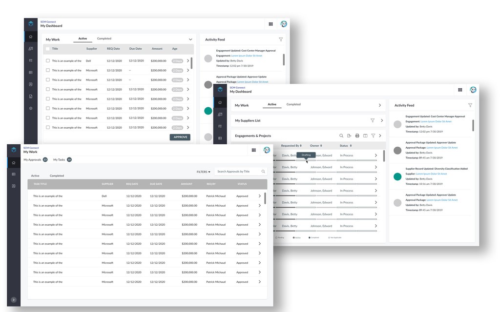
The existing SCM experience required executives and operations teams to navigate multiple disconnected dashboards to complete basic workflows. Critical actions were buried under static reporting interfaces, leading to delayed decisions, manual workarounds, and reduced confidence in system data.
Analytics showed users frequently abandoned the workflow after step 2 due to unclear system states.
How We Diagnosed It
Analytics told us users were abandoning the workflow at step 2. But analytics don't tell you why. I ran structured sessions with eight executive users, the actual decision-makers this system was built for, and three consistent failure patterns surfaced immediately.
First: they couldn't tell what needed their attention. The dashboard surfaced everything equally, which meant nothing felt urgent and critical actions were buried under noise. Second: they couldn't act without leaving the current screen, which broke their mental context and slowed decisions. Third: they didn't fully trust the data they were seeing, not because it was wrong, but because they had no visibility into when it was last updated or what state the underlying processes were in.
Those three findings drove every major design decision that followed. Redesigning the dashboard wasn't the goal, fixing those three failure modes was.
CONSTRAINTS
This was not a greenfield redesign.
Legacy architecture limited real-time refresh and interaction flexibility
15 separate domains operating with inconsistent UI patterns
Bootstrap and mixed component libraries across teams
AAA accessibility compliance required
Executive users with limited time tolerance
STRATEGY & APPROACH
Rather than redesigning individual screens, I reframed the challenge as a systems alignment problem.
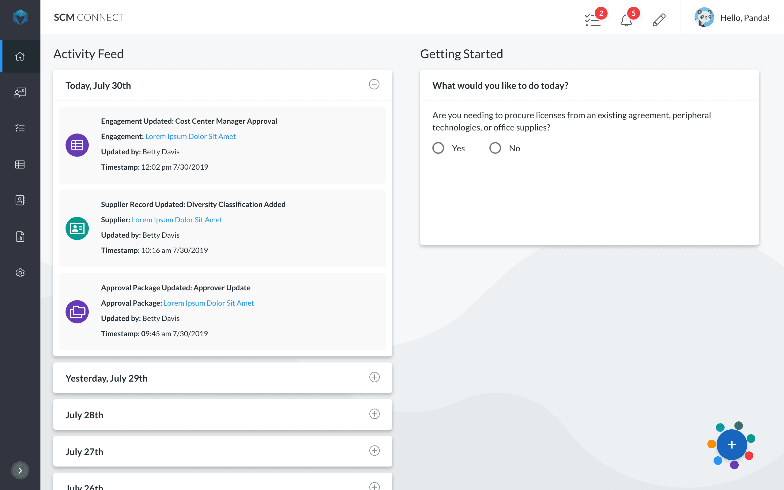
1. Shift From Reporting to Action
Redesigned the dashboard to prioritize decision-making workflows instead of static metrics.
2. Simplify Information Architecture
Consolidated redundant navigation layers and restructured hierarchy around operational tasks.
3. Standardize Component Patterns
Aligned new modules under a scalable component framework to support cross-domain consistency.
4. Collaborate Early With Engineering
The action-centered model required real-time state awareness from the backend, something the legacy architecture hadn't been designed to support. Before committing to high-fidelity execution, I ran a two-week feasibility sprint with the engineering lead to understand exactly what was and wasn't possible within the existing infrastructure.
Some of what I'd designed had to change. The live status indicators I'd prototyped required a polling architecture that would have added significant complexity for modest UX gain. We replaced them with a smart refresh model that achieved the same user goal, knowing the data was current, at a fraction of the implementation cost. That kind of early collaboration didn't slow the project down. It prevented us from designing two months of work that would have been scoped out before development started.


KEY DECISIONS
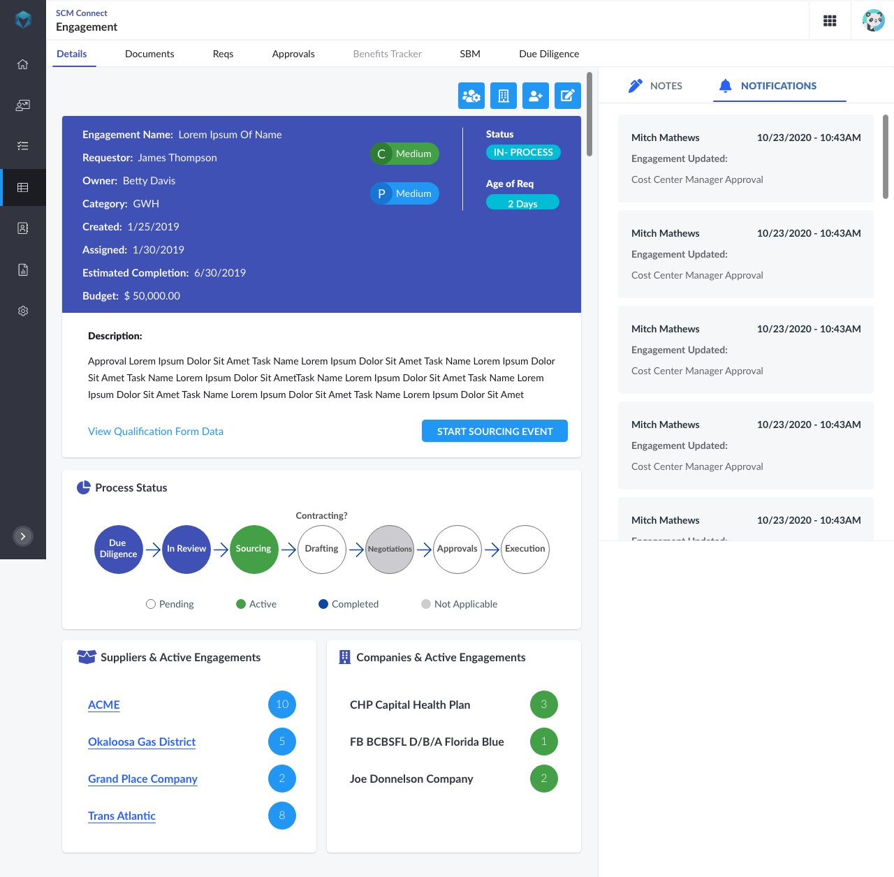
Decision 1: Action-Centered Dashboard Model
Replaced metric-heavy landing pages with task-oriented modules designed around operational triggers and executive review cycles.
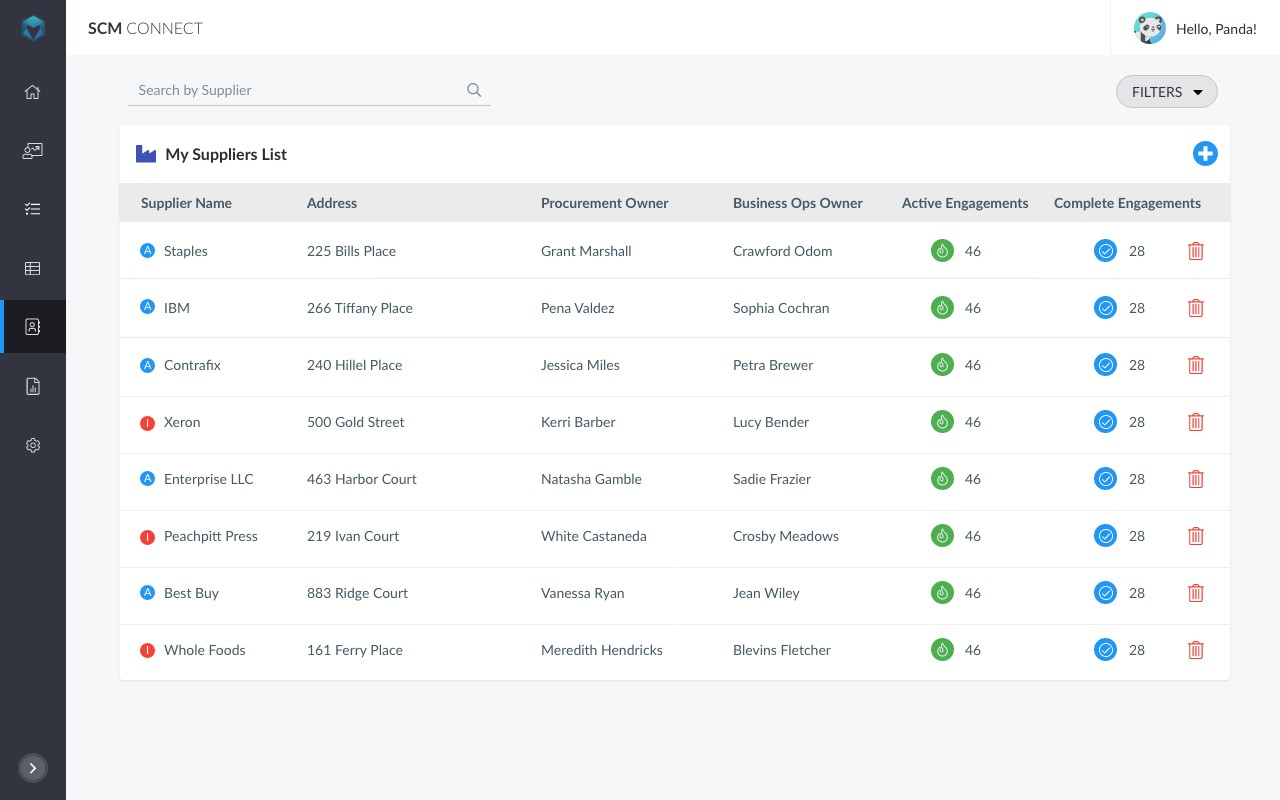
Image: Before vs After comparison
Decision 2: Modular Card Architecture
Designed reusable, state-aware card components supporting loading, success, and error states — allowing domain teams to extend functionality without breaking consistency.
Image: Component state variations grid
Decision 3: Reduce Cognitive Load
Introduced progressive disclosure and visual hierarchy adjustments to reduce density while preserving critical information visibility.
Image: Annotated UI close-up
OUTCOME
Post-launch analysis showed measurable operational improvement:
60% faster executive task completion
71% higher engagement with dashboard actions
Reduced reliance on manual reporting workflows
Improved stakeholder trust in system outputs
Qualitative feedback from leadership indicated increased clarity in daily operational oversight.
SYSTEM IMPACT
This redesign directly influenced broader design system evolution across domains.
Introduced standardized dashboard module patterns
Added 12 reusable components to the system
Refined token usage for layout and spacing consistency
Improved accessibility compliance through reusable interaction patterns
Strengthened design-engineering alignment via component documentation
This project became a reference model for future enterprise dashboards.