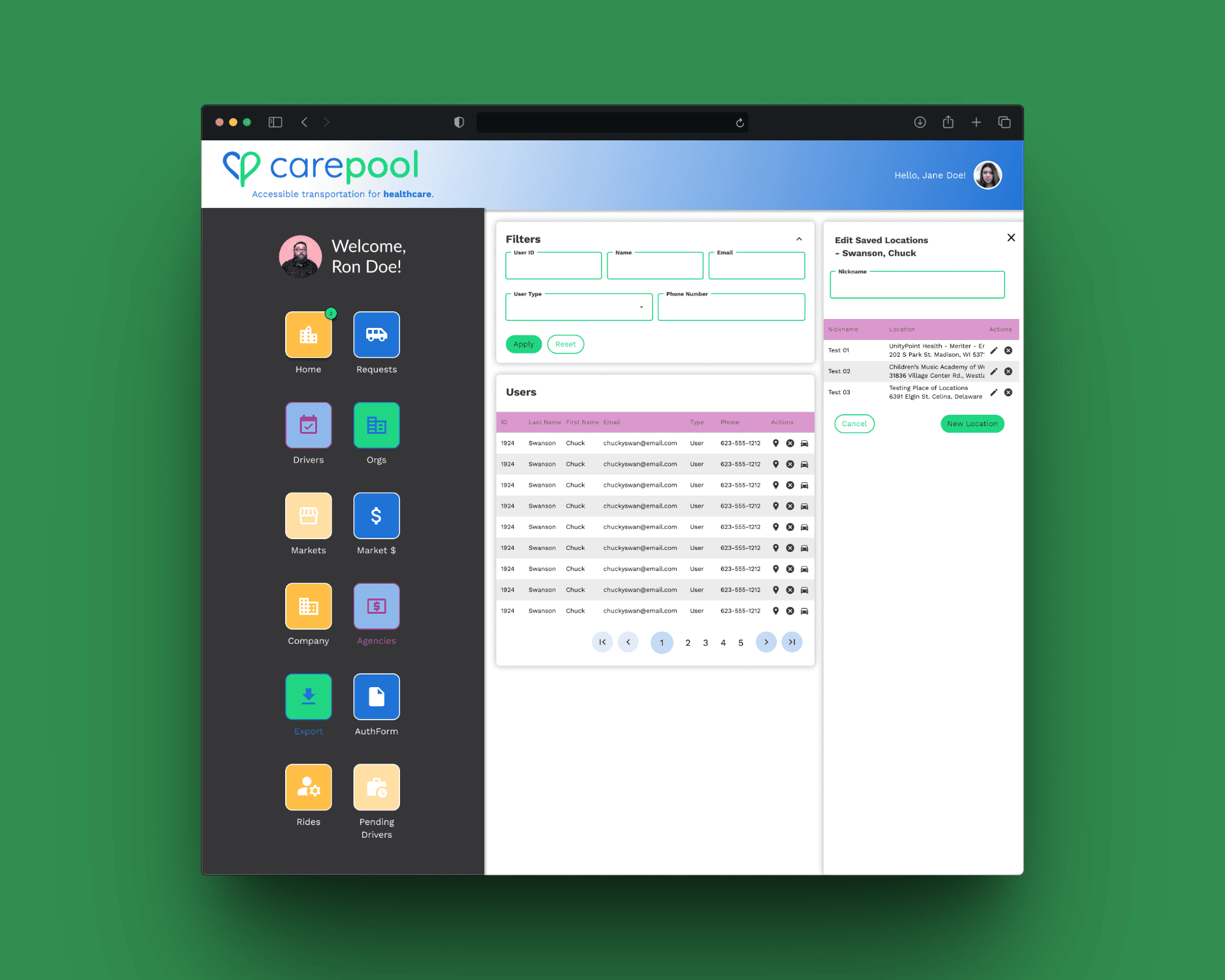
INTRO
Led the design of the CarePool iOS experience to support elderly and disabled riders through complex, state-based ride workflows. Focused on clarity, safety, and trust while simplifying multi-step coordination into an intuitive mobile flow.
Role: Lead Product Designer
Platform: Native iOS
Team: CEO, PM, Engineers
Focus Areas: State modeling, accessibility, trust UX, real-time coordination
Impact:
Improved booking clarity and rider confidence
Reduced support confusion around ride status
Increased successful ride completions through simplified flows
BUSINESS
iOS and Web Based App
YEAR
2025

THE PROBLEM
CarePool's users weren't typical mobile app users. They were elderly and disabled riders who depended on the service for medical appointments and essential daily needs, often under stress, often less tech-confident, and often unable to quickly recover from a confusing interaction. For these users, a vague ride status screen isn't a minor UX annoyance. It's a source of real anxiety.
The existing experience reflected a system designed around the ideal case: ride booked, driver en route, pickup successful. What it didn't account for was everything else, delays, reassignments, cancellations, unclear confirmations. When the system went off-script, users had no reliable way to understand what was happening or what to do next.
CONSTRAINTS
This was not a simple booking app.
Riders included elderly and disabled users
Accessibility standards were critical
Real-time status changes had to be clearly communicated
Small-screen mobile constraints
Edge cases: cancellations, delays, reassignment
Every interaction had to account for multiple system states.
STRATEGY & APPROACH
Rather than design static booking screens, I modeled the product around ride lifecycle states.
1. State-Based Architecture
Mapped the complete ride lifecycle:
Requested → Confirmed → En Route → Arrived → In Progress → Completed → Canceled
Each state required distinct UI treatment and feedback clarity.
2. Trust-Forward Interaction Design
Emphasized:
Driver identity visibility
Clear pickup details
Reassuring confirmation language
Reduced ambiguity in system messages
3. Accessibility-First Patterns
High-contrast UI
Larger touch targets
Simplified language
Reduced cognitive load in navigation
4. Minimized Cognitive Overhead
Designed for users who may be:
Less tech-savvy
Under stress
Managing medical appointments
Focused on progressive disclosure and simplified next-step clarity.


KEY DECISIONS
Decision 1: Surface Ride State as the Primary Anchor
Made ride status the most dominant visual element on each screen, ensuring users always understood where they were in the journey.
Image: Active ride screen with emphasis callout.
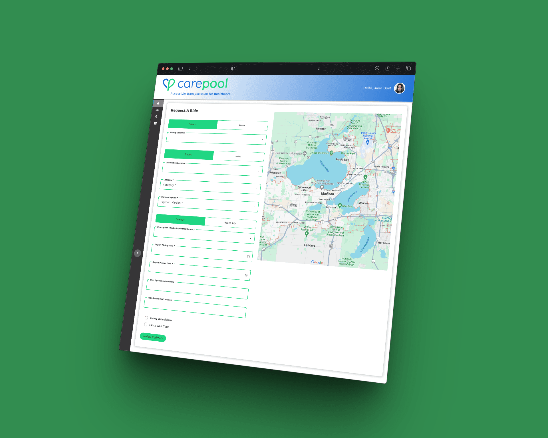
Decision 2: Reduce Multi-Step Booking Complexity
Collapsed multi-screen booking steps into a guided, sequential flow with clear confirmation checkpoints to reduce abandonment and confusion.
Image: Booking flow progression.
Decision 3: Design for Edge Cases First
Modeled cancellation, delay, and reassignment states before designing ideal flows to ensure the system remained predictable under stress.
Image: Edge-case state comparison grid.
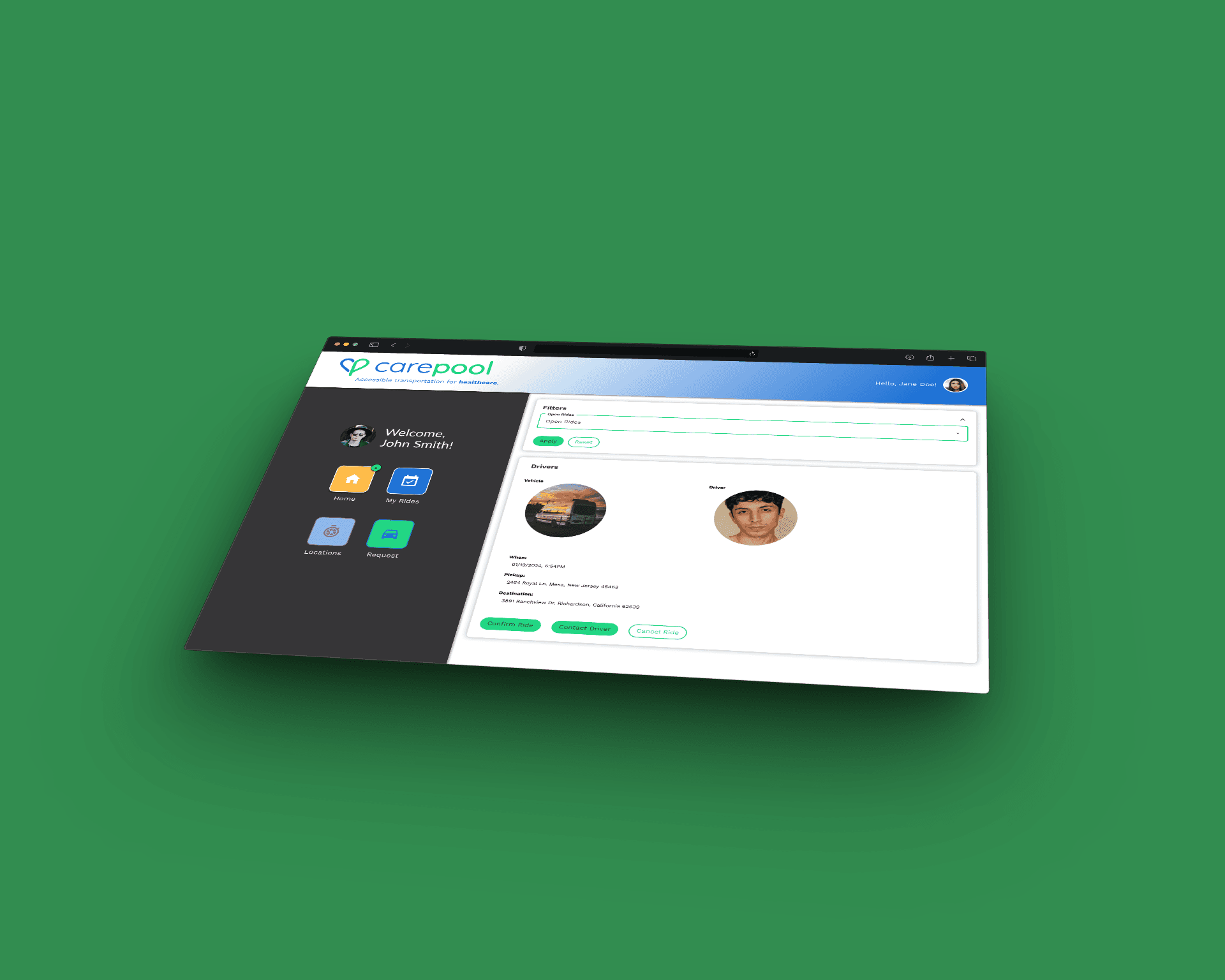
Decision 4: Reinforce Trust Through Identity Transparency
Prominently displayed driver photo, name, vehicle, and ETA to reduce anxiety and build confidence in the ride process.
Image: Driver detail screen.
OUTCOME
Post-launch support data showed a meaningful drop in ride-status confusion tickets, the most common support category before launch. Qualitative feedback from riders and family caregivers who managed bookings on behalf of loved ones consistently pointed to the same thing: they knew what was happening, and they trusted it.
One caregiver noted that her mother, who had previously called her during every ride anxious about whether the driver was coming, stopped calling. That's not a metric. But it's the outcome the design was built for.
The state architecture built for this project also became reusable infrastructure, the lifecycle model and trust-forward pattern library established here was directly applied to two subsequent features without starting from scratch.
SYSTEM IMPACT
Beyond UI improvements, this project established:
A reusable state-driven design pattern for future flows
Standardized ride lifecycle logic across mobile screens
Improved alignment between UX and backend state modeling
Foundation for scaling additional ride features
The state architecture became a framework for future product expansion.